The Foals The Foals have a similar image to our band named The Factory. This similarity is in the way they present themselves and their style of music with a similar indie genre. The Foals use a distinct way of producing an album cover so that they are continuously recognized just by their font. They use two particular fonts. The first font that they used on their album and singles represents them being young and is alternative which is shown in the picture below. This font was also used in advertisements about them until they produced their second album.
The second font that they used is plain square capital letters which suggests that they have matured and are more sophisticated. This was used on their second album and also advertisements since their second album was released. At this point in their careers they were no longer an independent band, they have built their fan base and are now more commercialized and 'mainstream'.
Their CD cover font corresponds with the font that is used in an advertisement made to promote the bands' perhaps new identity. This font is a symbolism of the band. This is also the case for other bands such as The Libertines.
The Libertines
The Libertines for example, also use a particular font and style of design on their CD covers and adverts. The writing is slightly broken up and put at a slant to each other. This represents their crazy, shambolic ‘do it yourself’ attitude. It is designed to show their individuality rather than be a part of the institutional machine. It also shows that they are highly influenced by the Sex Pistols, The Clash and the ‘punk’ era.
The Kooks
The Kooks are another band with a similar image to our own. They have the same style of music and a similar dress sense. We are highly influenced by them into making our digipak. Taking into account the font of writing which must be continuous and a similar colour scheme on all of ‘The Factory’s’ CD’s, we want to use a similar type of style as The Kooks and Arctic Monkeys. Here are some of there CD covers which they have used.
It is also show through adverts that the same theme is used, for example, in the Glastonbury Advert below, the same font is used as well as the black, grey and white colour scheme.
Arctic Monkeys
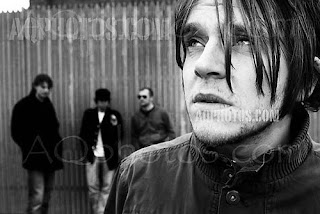
The Arctic Monkeys seem to have a running theme of black, grey and white. We want to represent our bands image with similar artwork, however although we want to show that they are sophisticated and alternative, we also want to represent that they still have a ‘messy’ streak about them. This CD cover below is the biggest influence to us and after a group discussion, we have decided to do a black and white photo of our band (to show sophistication) with a font to show their influences (perhaps slightly 60’s) as they are clearly influenced by guitar bands of the 60s such as ‘Love’ and ‘The Stooges’. We also want to use a similar smudge effect as the CD cover below. Although they are not widely known, they have a sizable cult following and are clearly influenced by other bands which are likely to be appreciated by their target audience and fan base 

These are two examples of front CD covers which are both black and white because this is the look that we want to create for our band. There is an example hear of the arctic monkeys CD cover who are the original artist of our song. They embody the same style as we would like for our band, although they are different in many ways.
We want to show all of the band members as its there first album and want the bad to have an established identity. We also really like the splatter effect on the side of the picture because we feel it has a link to our song and our band because of there teenaged messiness.
We want the other 3 sides to our CD case to be from our 7 wide shoots of the changing room. One will be very messy and student like, the next side will be of the expensive mess of Champaign bottles etc. the last side will be the band members in there finished studio surrounded by amps and looking smart, as fully formed stars. We want these 3 shots to be just simple photos of the band in different positions around the room which we will take during the shoot day.
On our front cover we want different from these shots shot on a different but simple background such as up against a brick wall or just plain white. We also want them to be wearing the clothes of the style they end there video in (shirts and boots as apposed to t shirts and trainers).


No comments:
Post a Comment